Moderators maybejames Posted March 21, 2014 Moderators Share Posted March 21, 2014 The curvage site graphics always seemed abit 'default' to me, I thought I'd have a go a remaking them, maybe making them abit more relevant and up to date As much as I've grown rather fond of Miss Curvage: I don't think she does justice to the lovely ladies whose pictures are posted here, I thought something like this might be better: I don't know how easy it is to change the assets for the website, but I used the original image dimensions for these mock ups... What do you think of these ideas? (these are just suggestions btw : ) Link to comment Share on other sites More sharing options...
wilan Posted March 21, 2014 Share Posted March 21, 2014 I like your ideas, and the graphics could certainly do with a makeover. Link to comment Share on other sites More sharing options...
patcleburne Posted March 21, 2014 Share Posted March 21, 2014 Contest....Girl of the month....etc.....Run with this.... Link to comment Share on other sites More sharing options...
Guest Atlya Posted March 21, 2014 Share Posted March 21, 2014 Hey, not bad at all, especially the logo ones. Link to comment Share on other sites More sharing options...
S77 Posted March 22, 2014 Share Posted March 22, 2014 I really like these. Great work. Would you be able to send some psd files? Link to comment Share on other sites More sharing options...
Moderators maybejames Posted March 23, 2014 Author Moderators Share Posted March 23, 2014 I really like these. Great work. Would you be able to send some psd files? Yeah I can do, did you have a favourite? Link to comment Share on other sites More sharing options...
Heart and Mind Posted March 23, 2014 Share Posted March 23, 2014 Would be nice to change. Nice ones :thumbsup: Link to comment Share on other sites More sharing options...
Guest Atlya Posted March 24, 2014 Share Posted March 24, 2014 Yeah I can do, did you have a favourite? Logo 3, logo 3! But I'd do with a random of the three or several skins maybe? Link to comment Share on other sites More sharing options...
S77 Posted June 25, 2014 Share Posted June 25, 2014 can you send them all? Link to comment Share on other sites More sharing options...
Moderators maybejames Posted June 26, 2014 Author Moderators Share Posted June 26, 2014 can you send them all? Hey, I sent them to you ages ago, maybe they went in to spam or something... I've sent them again to your lovethesecurves email! Link to comment Share on other sites More sharing options...
xandercroft Posted June 28, 2014 Share Posted June 28, 2014 I like the new logo! Link to comment Share on other sites More sharing options...
Guest Atlya Posted June 28, 2014 Share Posted June 28, 2014 I prefer the mock up font! Link to comment Share on other sites More sharing options...
Jiminy Posted June 28, 2014 Share Posted June 28, 2014 Love the new splash screen and logo. Good job. Link to comment Share on other sites More sharing options...
S77 Posted June 28, 2014 Share Posted June 28, 2014 I prefer the mock up font! it's very classy but difficult to read and ended up looking like Campbell's soup or Coca-Cola Link to comment Share on other sites More sharing options...
Guest Atlya Posted June 28, 2014 Share Posted June 28, 2014 it's very classy but difficult to read and ended up looking like Campbell's soup or Coca-Cola Instead we get a 90's logo that's way to big and invading. I'd rather have had the lady a bit bigger. Bleh, whatever. Link to comment Share on other sites More sharing options...
Moderators maybejames Posted June 28, 2014 Author Moderators Share Posted June 28, 2014 it's very classy but difficult to read and ended up looking like Campbell's soup or Coca-Cola Yeah I think you are right, I was sorta thinking a curvy font for the curvy ladies haha! Instead we get a 90's logo that's way to big and invading. I'd rather have had the lady a bit bigger. Bleh, whatever. like this? Link to comment Share on other sites More sharing options...
hiro Posted June 29, 2014 Share Posted June 29, 2014 What's going on with her hair? Is she supposed to be wearing something on her head? I can make out the shoes, but my imagination isn't good enough to make sense of the bra. Link to comment Share on other sites More sharing options...
Dr. Feeder Posted June 29, 2014 Share Posted June 29, 2014 I love the site and hate to complain but: Why faceless models in the logo? I never liked the old one or the new one for that reason. It suggests that all we care about is curvage, not the actual curvy person. Maybe that does represent the attitude most men here have, but it doesn't work for me. And I guess there's something creepy about her face being wiped out...if you want to leave out the face so as to avoid suggesting a specific woman, why not have her just turn her head? Link to comment Share on other sites More sharing options...
Guest Atlya Posted June 29, 2014 Share Posted June 29, 2014 Yeah I think you are right, I was sorta thinking a curvy font for the curvy ladies haha! like this? I very much like that one personally. You are good, sir. I love the site and hate to complain but: Why faceless models in the logo? I never liked the old one or the new one for that reason. It suggests that all we care about is curvage, not the actual curvy person. Maybe that does represent the attitude most men here have, but it doesn't work for me. And I guess there's something creepy about her face being wiped out...if you want to leave out the face so as to avoid suggesting a specific woman, why not have her just turn her head? Well, it is the name of the site. It's not that "curvage" is more important than anything else, it is that it's the common denominator. Link to comment Share on other sites More sharing options...
S77 Posted June 29, 2014 Share Posted June 29, 2014 another thing Link to comment Share on other sites More sharing options...
S77 Posted June 29, 2014 Share Posted June 29, 2014 not all that much convinced. I think it's too busy or something. Link to comment Share on other sites More sharing options...
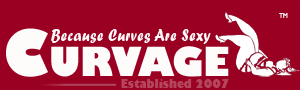
Guest Atlya Posted June 29, 2014 Share Posted June 29, 2014 not all that much convinced. I think it's too busy or something. Remove the ".org" and the "established in" (so that's what est. means?), it's silly, this site is not an ale production entity... with those off, it'd look pretty nice (shadow is silly indeed and it makes it "too busy", as you say). Link to comment Share on other sites More sharing options...
S77 Posted June 29, 2014 Share Posted June 29, 2014 ... Link to comment Share on other sites More sharing options...
wilan Posted June 29, 2014 Share Posted June 29, 2014 ... I like that one. :thumbsup: Link to comment Share on other sites More sharing options...
Guest Atlya Posted June 29, 2014 Share Posted June 29, 2014 ... I like it too, simplicity at its best. Although I'm not too certain on the catchphrase position. But it's pretty cool. Catchprase before site name rings kind of nice. I vote for this! Link to comment Share on other sites More sharing options...

Recommended Posts
Create an account or sign in to comment
You need to be a member in order to leave a comment
Create an account
Sign up for a new account in our community. It's easy!
Register a new accountSign in
Already have an account? Sign in here.
Sign In Now